Thursday 25 December 2014

Oh the tribulations of disposing of assignments

You probably don't have an assignment like this one though...

As you can see, this particular first year assignment takes up white a bit of space. Many people may look at it and think, "there is no way I could make something like that!"
I am looking at it and thinking, " man I was a terrible costume maker in first year!"

Now, alas, all it is doing is taking up space. If any of you scrollers and clickers have an idea of how to get rid of it, please comment.


Truely, it is taking over my work space...


Sunday 9 November 2014

The Making of Magic Wands

Because the weather has come out to say hello, I thought creating things outside would be a lovely idea indeed.
For a prize in a game, I created hand-made magic wands. There was plenty of tips on the internet about how to do this, and it was a fun experience.
So, tool list -


  • Sticks
  • Wooden beads
  • Glue gun with glue
  • Paint
As you can see, I chose dowel sticks and chopsticks for my wands to create a variation in styles.


To create the forms, I take the glue stick and I add glue in any style. There are plenty of images on the web for inspiration. On the right image, you can see there is already one glued up. 


While I'm outside, may as well make the use of what's available to me. I stuck them in the ground while they were drying. Handy, as the beads had a tendency to want to rebel against being attached to the wand in either direction. Making the shape is ridiculously enjoyable.


Using acrylic paint, I painted on a base coat.


Here are some of the finished products. I didn't manage to catch a photo of the two wands that were given out as prizes, but the other four look pretty amazing. My boyfriend, being well skilled at painting miniatures, painted the detail. He enjoyed looking at the shape and working out how to colour it as much as I enjoyed making the shapes.


Wednesday 5 November 2014

5 and 10 minute sketches

What doing quick sketches does is free you up so much. Very often, we have an idea in our head, we get to the canvas or paper and think "I'm going to paint the best painting ever!" What happens nexts is we get tight and careful. We go away, practice every little aspect of the painting and then realize that our studies are better than the final product!
One lady in my art class comes into each work without an image in her head, and everything she does is an experiment. Everything comes out beautifully.

I need to learn not to srtive for perfection, goal setting or aims. I just need to just do and just be.

Tuesday 4 November 2014

Midnight sketch and the importance of failing

When I set myself out with an agenda, I fail. Always. When I have the end product, how I want people to react, I fail. When I set time tables and goals and care what people think about what I'm doing,  I fail.
I've learnt to do art backwards. In VCE (Victorian Certificate of Education) we are told to create a mood, an idea, it's about what we want our audience to see.
The thing is, I've never been good at people pleasing. I have never figured out what people wanted from me. If I dive into an artwork thinking "what am I trying to tell my audience", well then, how can I see into the depths of my artistic spirit when I'm focuses on shallow eyes looking at me who aren't even there?
An artist needs space to fail, to grow, to learn. I see the term "happy accident" when reading blogs all the time. It's so much easier to see those when you're not on a time limit, have an agenda, or audience focused. You will never stop learning. You will always make mistakes. You will annoy yourself, your critics, your patrons (aka my dad). As soon as I focus outward and not inward, I lose the plot trying to gain approval with a perfect performance instead of trying to get what is in my heart to create out.
This is my midnight sketch. I want to call it "As Far as the East is from the West".
I know what it means to me. Do I know what it will mean to you? Of course not. I can't see your head. Will it have the same meaning as me? Probably not. I can't control that. It's out of my hands.

So here is a midnight sketch. It's messy, spontaneous, but let's see if it goes somewhere.

Thursday 16 October 2014

Thirty Days of Painting: day 8, 9 and 10

Day 8: Bread on watercolour


Very quick and dull activity this day - I promise the next two days are actually worth looking at.

Day 9: Watercolour pencil over watercolour wash over sketch

I have started a new art class, and he liked my sketches and suggested I tried letting the pencil show through and apply watercolour pencil for the detail. Didn't do it the way I imagined, but the results are interesting enough to look at.


Grey-led sketch

Watercolour pencil over the top

 Day 10: applying water

A little wet, and Didn't know what to do with the chest. It just looked weird, so I added her jacket which is on the image. Enjoy!

Sunday 12 October 2014

Thirty days of painting: Day 7

Day 7: Masking liquid

The preparation for this was done over a couple of days. I found the inspiration whilst going through watercolour technique boards and found a very cute blog, which many Pinterest searchers may have found already, as it's on the first page of Google.

What was used:
Watercolour paper
A sketch of a portrait
Watercolour paint
Number 18 synthetic round brush (cos, you know, they're all different)
A light box
Masking tape
Board

Step one: Have a portrait sketch


Ta-da!

Step 2: Mask the paper

Placing the sketched image under the watercolour paper. Using an old brush, paint over all the light areas of the face, as well as the hair highlights, with the masking fluid.
A watercolour teacher informed me that putting blobs of paint over the image will create an interesting effect. I wanted to see how it'd turn out.
Leave to dry for a few hours or over night.

The lighting isn't spectacular on this one.


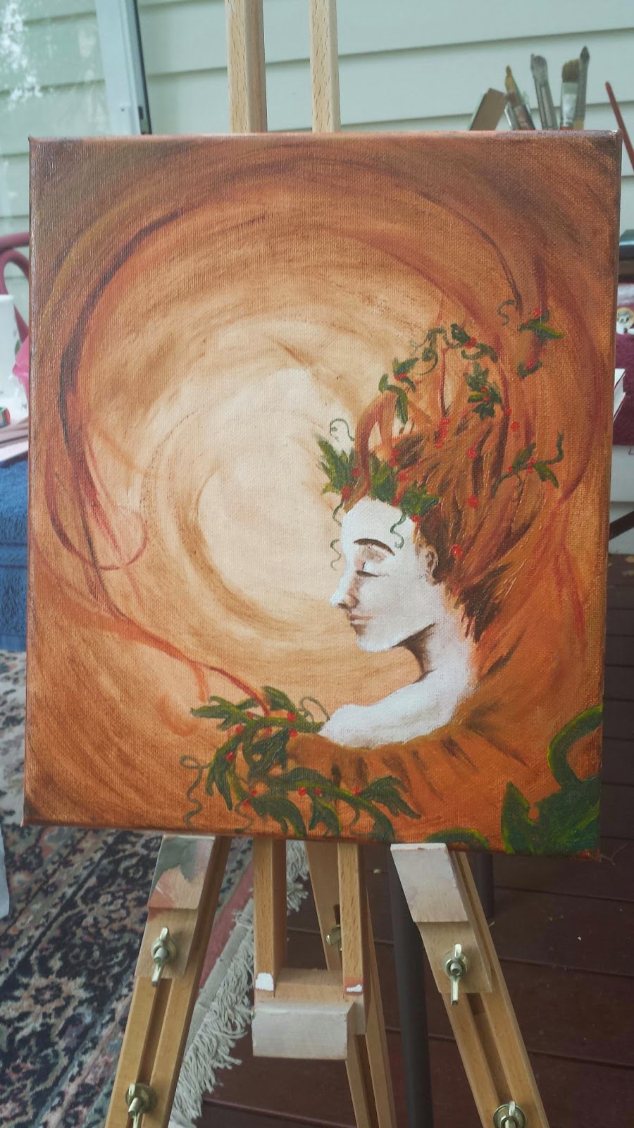
Step 3: Paint over the image with watercolour

 As you can see, the blob-effect didn't work out the way I had planned. This is probably be because, for the blobs, I used student watercolour instead of artists watercolour. Once dry, the student watercolour does not un-dry. However, artist's watercolour is soluble no matter how long you leave it.

You can see much more of how the figure will look. Again, not a good image due to energy-saving kitchen lighting.

Step 4: Remove the masking fluid


 ITS COMING ALIVE!
 SHE LIVES!


I'm not nearly happy about the left eye as I am with the right. The more masking fluid I used, the globbier the brush became as the latex dried over the bristles. By the time I was onto the left brush, all that came off my brush was large chunks, and I didn't have much control at all. I may have to look into some kind of foam brush.
This is a very good example of how different artist's quality paint verses student quality paint looks. I am quite surprised at how different it looks, even the blobs on the page look so much duller than it's surroundings.
I know what you may be thinking - it's a different blue, of course it'd end up looking duller!
So, I've gotten some image of other things I have painted using "terquoise" paint so you can compare the difference for yourself. Used  by the same scanner and everything.


Thirty Days of painting: Days 4,5 and 6

Day 4: Watercolour and salt

This one took me a couple of attempts. The paint has to be dark enough and thick enough to really get the absorbed affect. It's probably better to use artists quality paint, unless you use it thickly straight from the tube. I'm quite happy with the effect this one has made.
Crimson and ultramarine blue.


Day 5: Watercolour blow painting

Though, I actually ended up using acrylic. I think the advantage of watercolour I would have gotten is that I could have added more paint into the faded areas instead of making an entire new layer due to acrylic's fast-drying nature. For this reason, I'd more likely to do watercolour over a wash of acrylic instead of the other way around. Theoretically, watercolour is water-soluble even after drying, unless you're using cheap, children quality or student quality paint, (which I did.)
It's funny how much I'm actually learning about how paint reacts to each other just by doing these simple little things. Surely I'll be an expert in no time! 


Day 6: Gravel effect

It doesn't look much like gravel, it was a good effect to practice.
This one was a layer of acrylic paint, dried, then with a sponge painted with a layer of darker-coloured paint, lightly dabbed the surface of it onto the paper.
I would have liked a darker layer, and one that I did not have to dab twice. That lost it's effect instantly. I coloured in some of the circles to create the look of stones. It didn't work nearly as well as the artist's idea in the book, but it's a good technique to have tried and to know where I went wrong.


Friday 10 October 2014

Thirty days of Paint: Day 2 and 3

Very small, basic experiments that I make specifically to NOT be a masterpiece is quite liberating. I'm not in the mind-set of this must be a work of art or else I have wasted my time.

Day 2: Much of the same 

Wet on wet acrylic with water colour over the top. Acrylic is a permanent, where as the green could be taken off with water. Lesson in permanency.

Day 3: Splatter painting

Inspired by My Flower Journal, experimenting with splatter. Came out with a very random creation, not nearly as excellent as Tammy Northrup's, but then again, she is well practiced at them.


Have done three so far, 10% there!


Wednesday 8 October 2014

Thirty Days of Painting: Day 1

Breaking the perfectionism

I'm a bit of a perfectionist. Not much, but just a bit. Enough to make me feel self conscious about having a blog about my creations, anyway. And, sometimes, if I don't have a finished artwork, one that looks good, that's world changing or good enough that it might be shown at the Met, the Louvre and the Guggenheim whilst people are pirating it and selling mugs of it on eBay, I don't feel like it's worth painting.
This is something I need to get over, because as a learner artist, that is everything I create. What's detrimental about this mindset is that it doesn't give me mistake room. If it's not good enough, I don't show it, I don't learn, I don't try new things.
This must stop. Now.
So, for the next thirty days, I will be posting small paint experiments to get the artistic juices flowing, to force me to move forward.
Bare with me, Okay?

Day 1: Cling wrap relief texture.

Easily done - apply a single wash of watercolour, grab some cling wrap, scrunch it up a bit, then place it over the top until dry.

I was going for something I could use for a random marble effect, but I don't think it'll do. Probably better used for a cracked look, where a painting or a wall has started to peal away and expose the board underneath.

Stay tuned in for tomorrow's painting experiment!


Friday 3 October 2014

Sketch Study Saturday

This week I'm posting a study of different lips, some male, some female. Can you tell which is which?

Saturday 20 September 2014

Post-modern impressionist anime challenge

An interesting combination. I was challenged to paint something that was an impressionist, post-modern painting that was also an anime.
I managed to find an anime series that was described as post-modern by the likes of Serial Experiment Lain. I used one of the promotional images and painted it in a contemporary impressionist style.

Monday 18 August 2014

Resume update

Line art done for my resumè. Printed on parchment paper. Going to do full colour in watercolour and gouache. Going to experiment with various techniques.

Monday 14 July 2014

Breaking the rules of sewing

There have been many rules about not sewing knit fabrics to woven ones. I have destroyed that rule in the name of comfort.

For this child's dress made from recycled material, don't believe the esthetics should interfere with comfort.

Friday 4 July 2014

Stall preparation

Some ribbons on the left and some patterns drafted on the right. Was intimidated by my giant pile of ribbons, wondering how I was going to sort them into aesthetically appealing colours. So, I used a visual marketing trick on myself:
When colours are in assorted into like colours, the appearance of variety increases.
I arranged them on a hook to the closest likeness to each of the primary colours. They look more approachable already. I just want to grab one and play with it!

Monday 30 June 2014

Upcycling Stall

Some concept drawings for my upcoming stall "upcycling". I am giving it a very bohemian look, as that's the kind of audience who are interested in recycled clothing. Strangely enough, when it comes to rough drafts I often feel most comfortable using BIRO pens.
They are just concepts at the moment. It will be interesting to see what becomes of them!

Thursday 26 June 2014

Sprucing up my CV

There's so much to read on those things before you get to the folio, so why not show them my talent where the written work is happening?
Works in progress.

Tuesday 24 June 2014

Cleopatra collar

I was asked to create a Cleopatra collar to match a white muslin dress with purple lining. It's made from leather and curtain block-out lining.
I can't wait to see the pictures of her wearing it!

Thursday 19 June 2014

My first oil painting

A group of friends were invited to paint on Gran's granny flat porch after she uncovered her late husbands oil paints.
Having no idea what we were doing, we had a great time. This is my first painting in oil paint. What do you guys think?

Tuesday 17 June 2014

Why Sons of David?

To those who know my face, I am Amy Dawson. They are often wondering why I came up with that name. Most people's first reaction is the same:

"But, aren't you a girl?"

 Though a very apt observation that I am not a body of men, the name isn't to be taken literally but symbolically. The name "Amy" has French roots, meaning "beloved". As does "David". Consequently, the name "Dawson" means "David's son". Unfortunately, the title "Son of David" has been taken up by gentleman during Roman times, also known as Jesus Christ. Perhaps you might have heard of him.

Though Jesus was very courteous and claimed no copyright or trade mark to that title, I did not want to use it lest there be great confusion. So, seeing as many Davids have had many sons, I chose the brand, "Sons of David."

The End.